Close
Close
Portfolio
About Me
Services
Get In Touch
Portfolio
About Me
Services
Get In Touch
back to top
Hello! I'm Betta, an Italian Graphic Designer passionate about branding. Here is my portfolio:
Show all
Branding
Digital Design
Editorial Design
Events
Logo Design
Packaging Design
Web Design
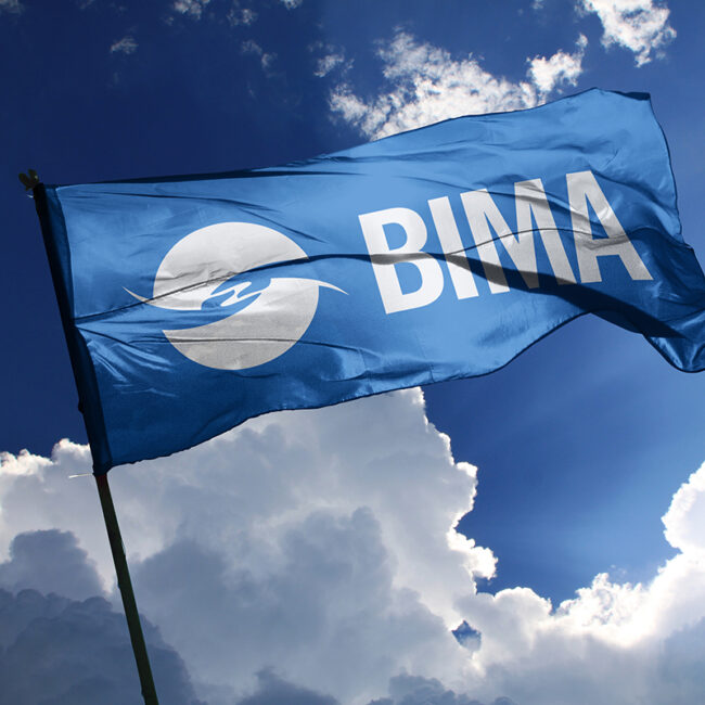
Bima Mobile
Branding
Digital Design
Web Design
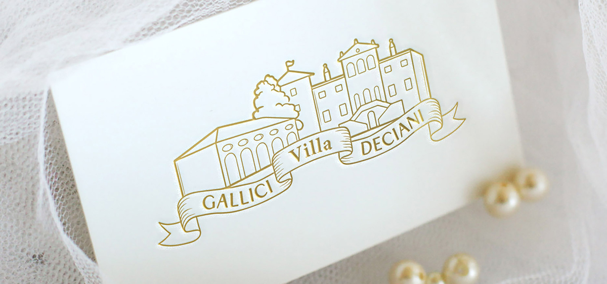
Villa Gallici Deciani
Branding
Logo Design
Web Design
Lavamela
Branding
Digital Design
Logo Design
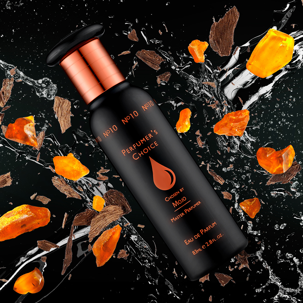
Perfumer’s Choice
Branding
Logo Design
Packaging Design
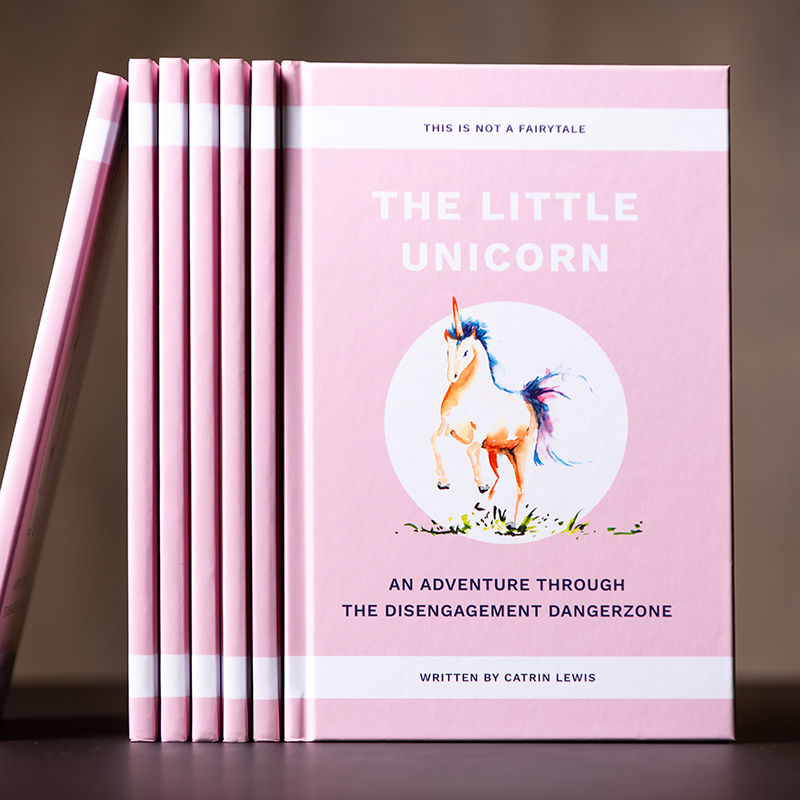
The Little Unicorn
Editorial Design
Engagement Excellence Awards
Branding
Editorial Design
Events
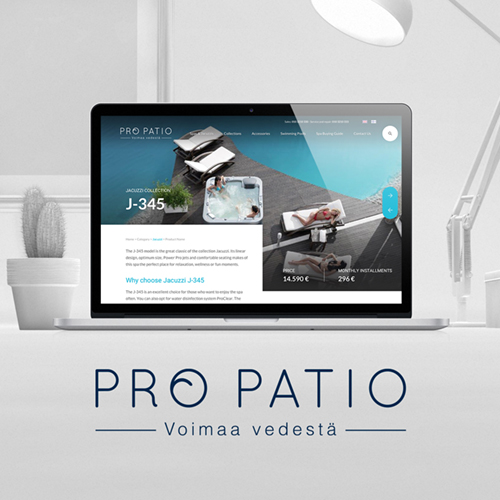
Propatio
Web Design
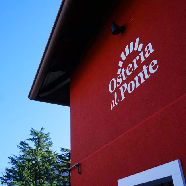
Osteria al Ponte
Branding
Logo Design
Web Design
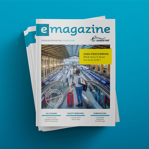
Eurostar
Editorial Design
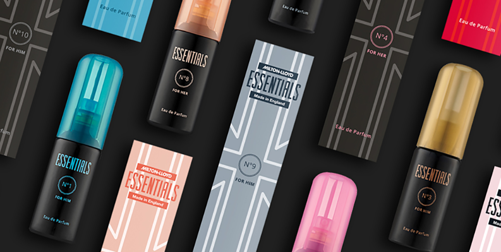
Essentials Perfume Collection
Branding
Packaging Design
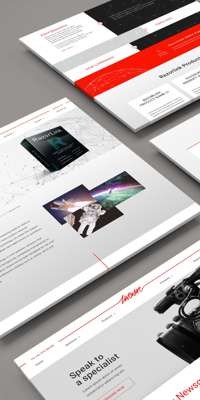
Livewire Digital
Digital Design
Web Design
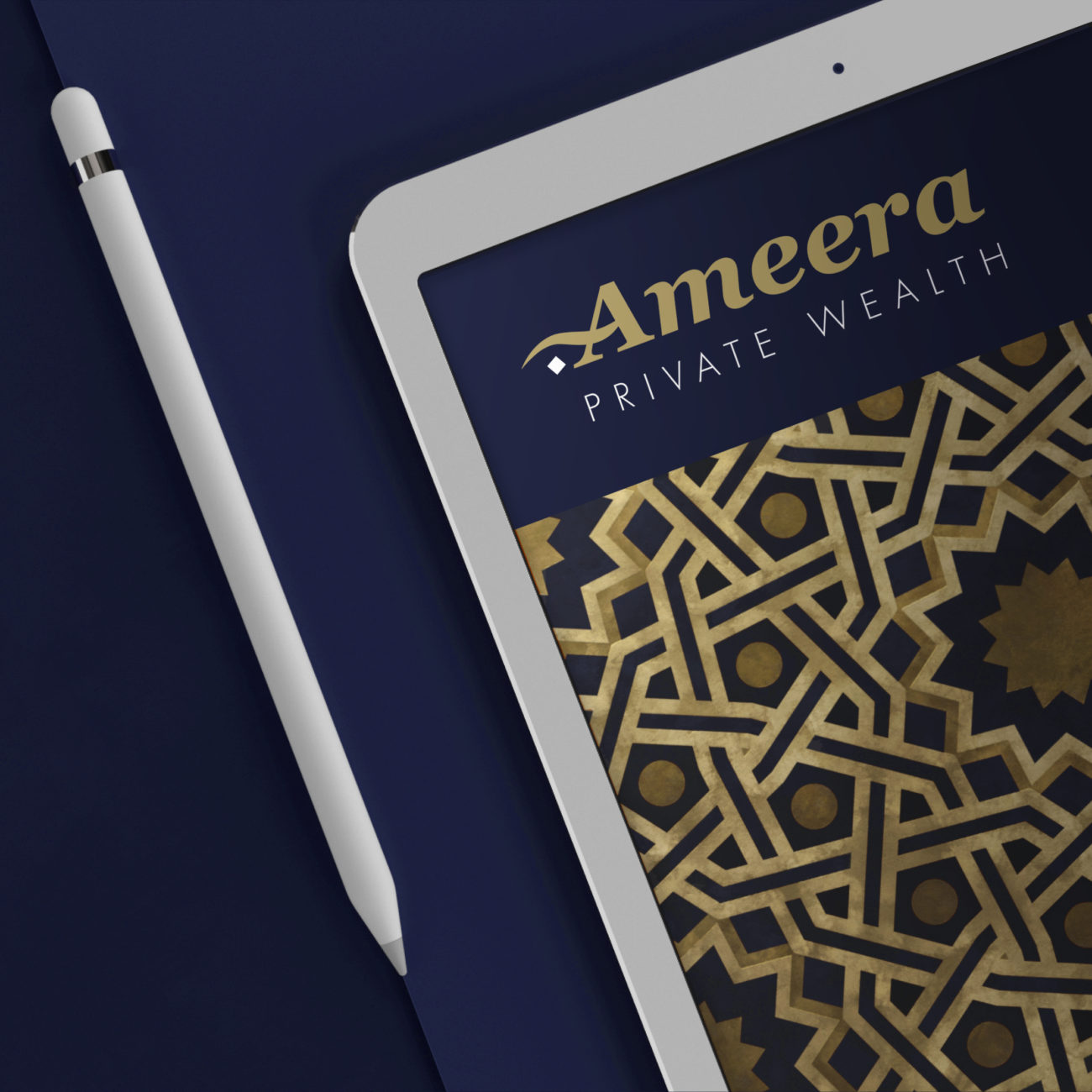
Ameera
Branding
Digital Design
Logo Design
My Journey Hampshire
Branding
Reward Gateway
Digital Design
Editorial Design
Events
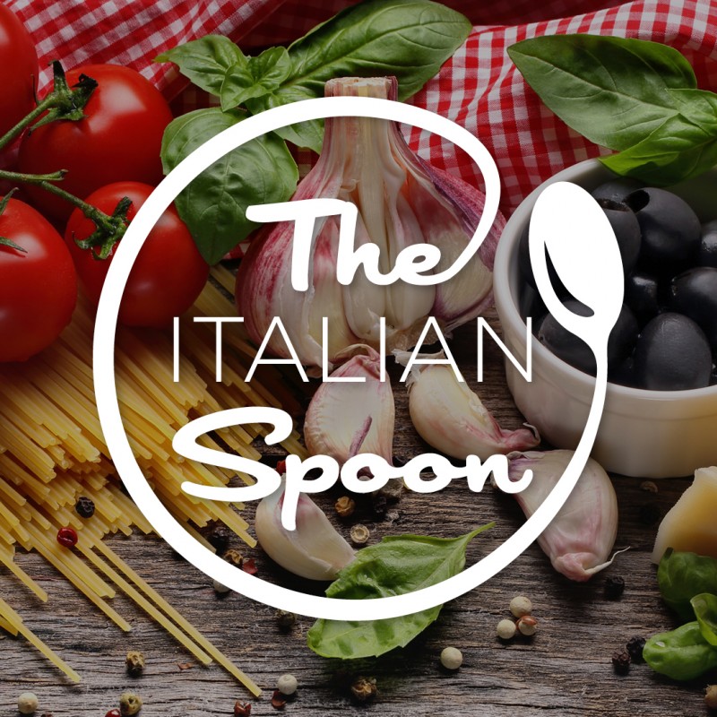
The Italian Spoon
Branding
Logo Design
EnEx Summit
Editorial Design
Events